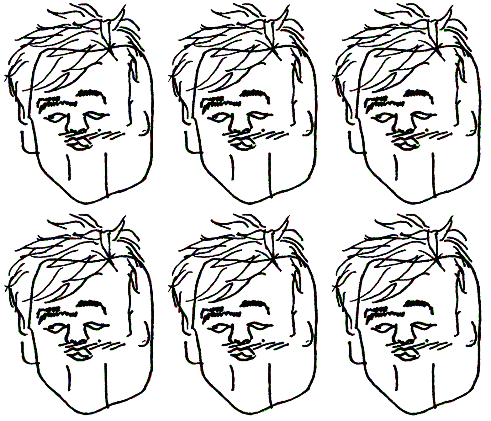
Granularity
gran·u·lar·i·ty : the scale or level of detail present

Part 1 Explore.
At the beginning of my Spring Semester, senior year at Ringling College of Art and Design, I was asked to do three things, Explore, Evoke, and Educate.

With such an open brief I decided to look back at my body of work, and study my past three and a half years at Ringling. In searching for recurring themes in my portfolio, I saw visually I placed high importance in understanding and animating noise, texture or moving patterns; whether it be the line boil of cel animation, or a more complex acetone transfer process.
Research.
Grain was originally created from various patterns of crystals suspended in gelatin distorting the image on a microscopic level. Today, having the advantage of digital cameras, computers, and softwares, we can simulate authentic grain textures, while also pioneering completely new techniques for manipulating these textures in a digital way.

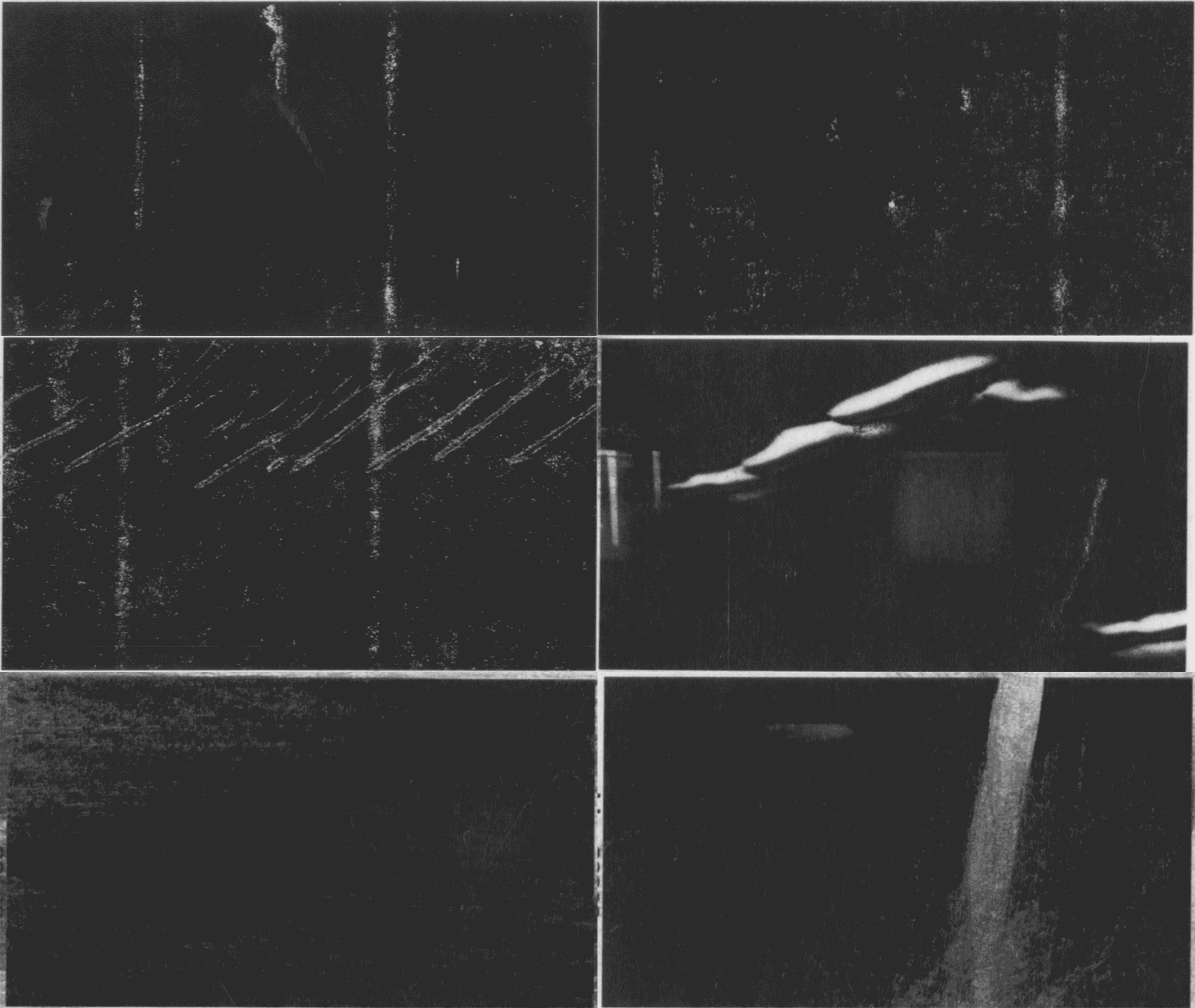
The familiarity and tactile quality that texture adds to a piece, can move an audience to have a much deeper connection to a work then they would have been able to have without. It's depth is something that’s taken for granted. The ability to visually feel a piece is an incredibly sensory gift; and I wished to explore this phenomenon further through the manipulation of texture grain and noise.
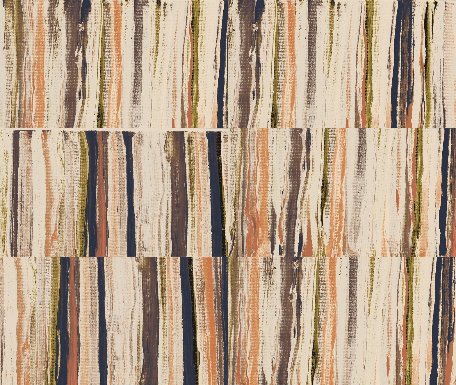
Grain is, at its core, a pattern. Once it is applied to motion, it doesn't take much to make it unpleasant, visual noise. However, at the right frame rate, animated noise can bring a deeper, enriched life to an otherwise flat and static image. The human brain is naturally hardwired to look for patterns. This fascination has been studied and referenced by Gestalt psychologists as the principle of grouping, or Prägnanz. This theory states that the mind can understand external stimuli as one whole, rather than a mere sum of parts. The human mind will continue to break down complex information until what is seen is something the brain can easily comprehend. For example, visualize a sand dune on a beach. You first recognize the dune as one form, rather than thousands of individual grains of sand. Similarly, when one looks at a screen, you first take in the entire image, rather than each individual pixel.
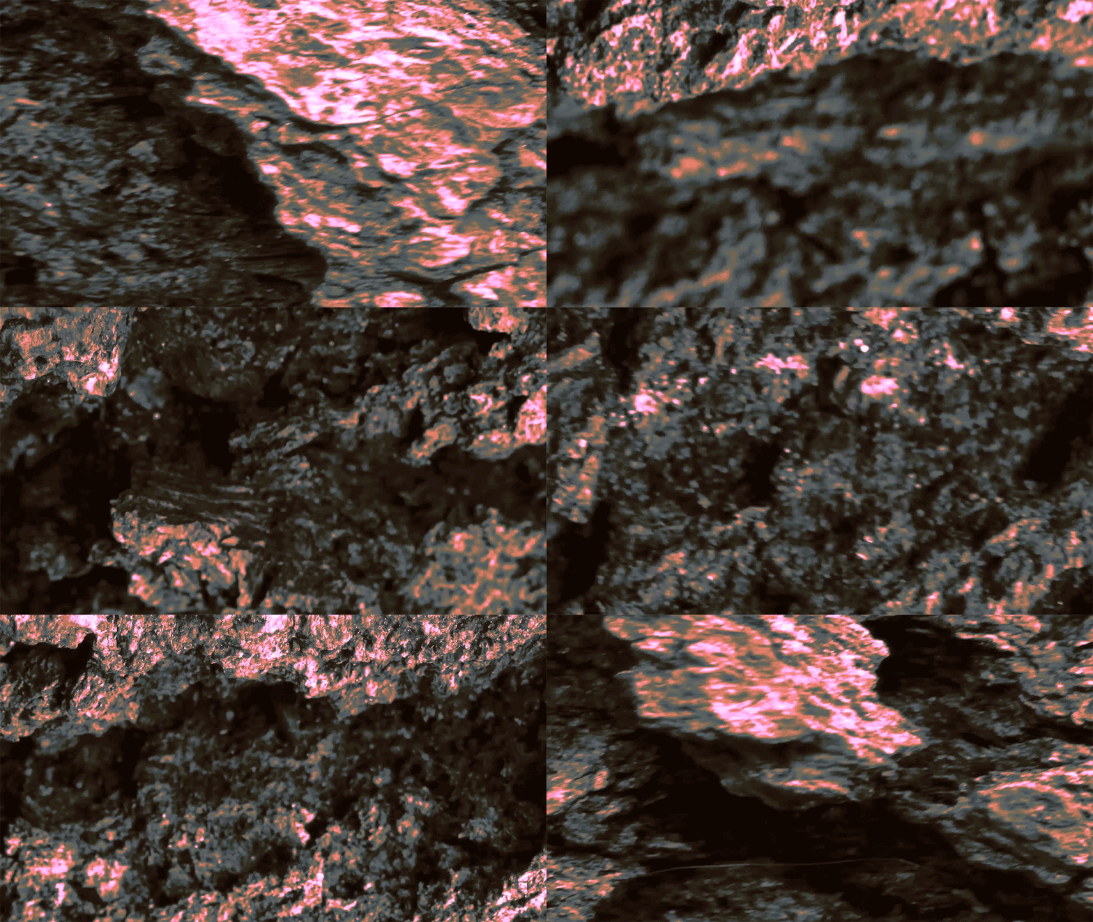
As the eyes see moving objects, the brain will begin to decipher the forms and hunt for patterns. Finding the ability to control and generate these patterns of grain is the basis for my experimentation.
Moving forward.
In my personal opinion, I've found that the Motion Design community has fallen on a trend of using grain arbitrarily. Unfortunately I found myself also guilty as charged, adding the default Adobe stipple grain to illustrations and animation simply for the sake of it looking cool. In this exploration phase, I not only wanted to explore new ways of developing grain and pushing resolution, but I also sought to create guidelines that could be used in future projects to help conceptually determine how an image's texture should be treated. For example, If we brought the same theory of shape language to the way we treat an image with grain, those same theories should carry over and still communicate. Soft and friendly design plus a soft and friendly grain should equal a soft and friendly animation. I’m not saying that if you put polka dots on a knife it wouldn’t look sharp and scary, but being able to design at such a small level of detail down to the grain, in addition to color, form etc. would only make your design that much more impactful.

Here are three guidelines I constructed to aid my implementation of grain, noise, and resolution into this project, as well as with future work.
Conceptual grain
Can the origin of the grain be derived from the subject matter of the image? If not, can it still conceptually relate.
Clarity
How far can you pixelate/distort the image and still retain beauty, readability, and form?
Emotional Language
Can we manipulate grain and noise into an emotional texture?
Synthesis.
After getting my hands dirty with various techniques I wanted to bring these tests to life through a story, its basis being the concept of granularity. By implementing the guidelines I came up with, in conjunction with these techniques, I wanted to draw direct parallels between grain and humanity. If you can distill an image into an individual pixel, then what does it look like if you distill an entire city into a single person.
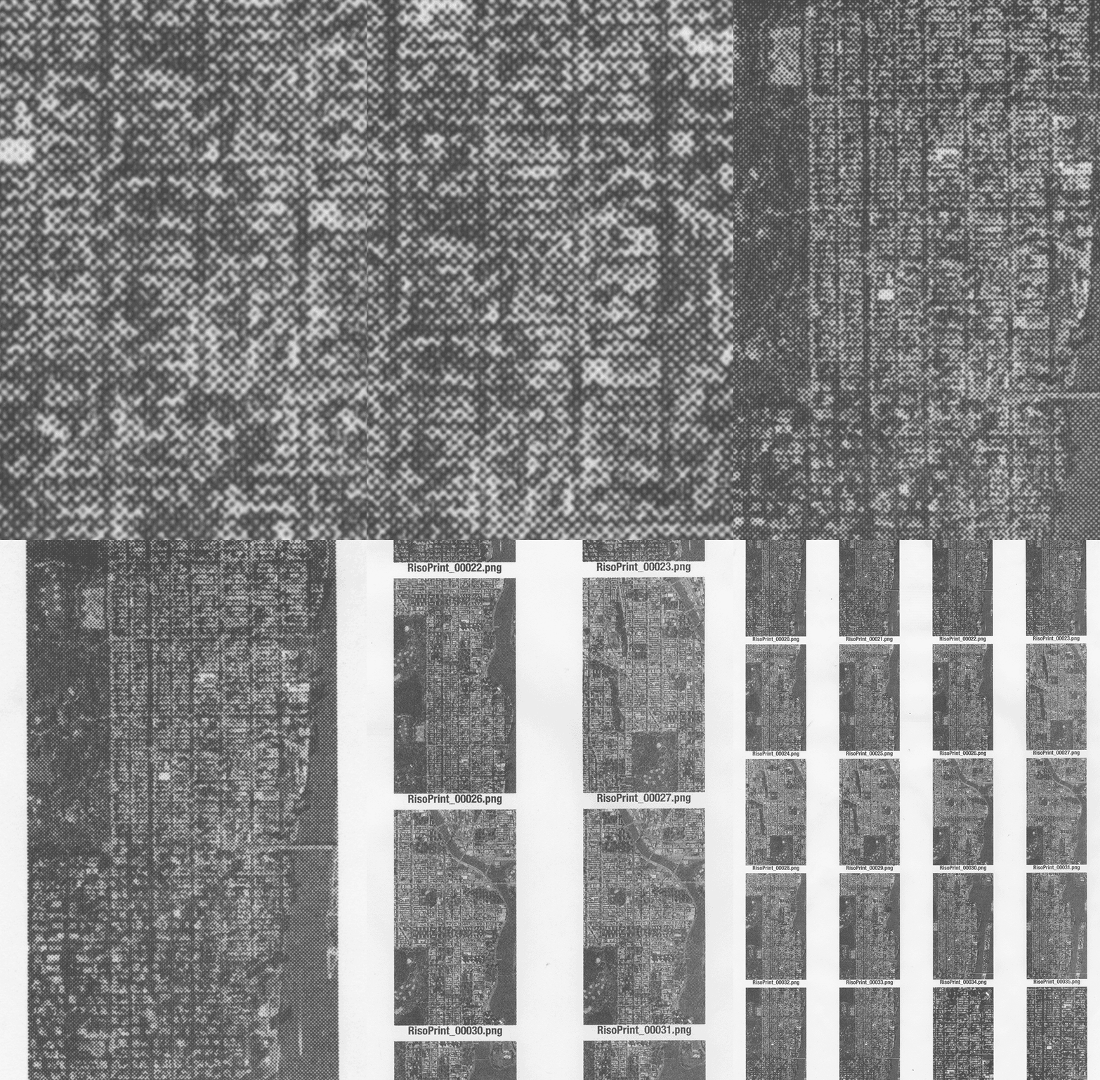
We open first with a wide aerial shot of the city. Here I processed each individual frame through a risograph printer. This technique was used because of it's close reminiscence of old maps. One could argue that the print's chattering round points allude to crawling ants, similar to how people look from high above.
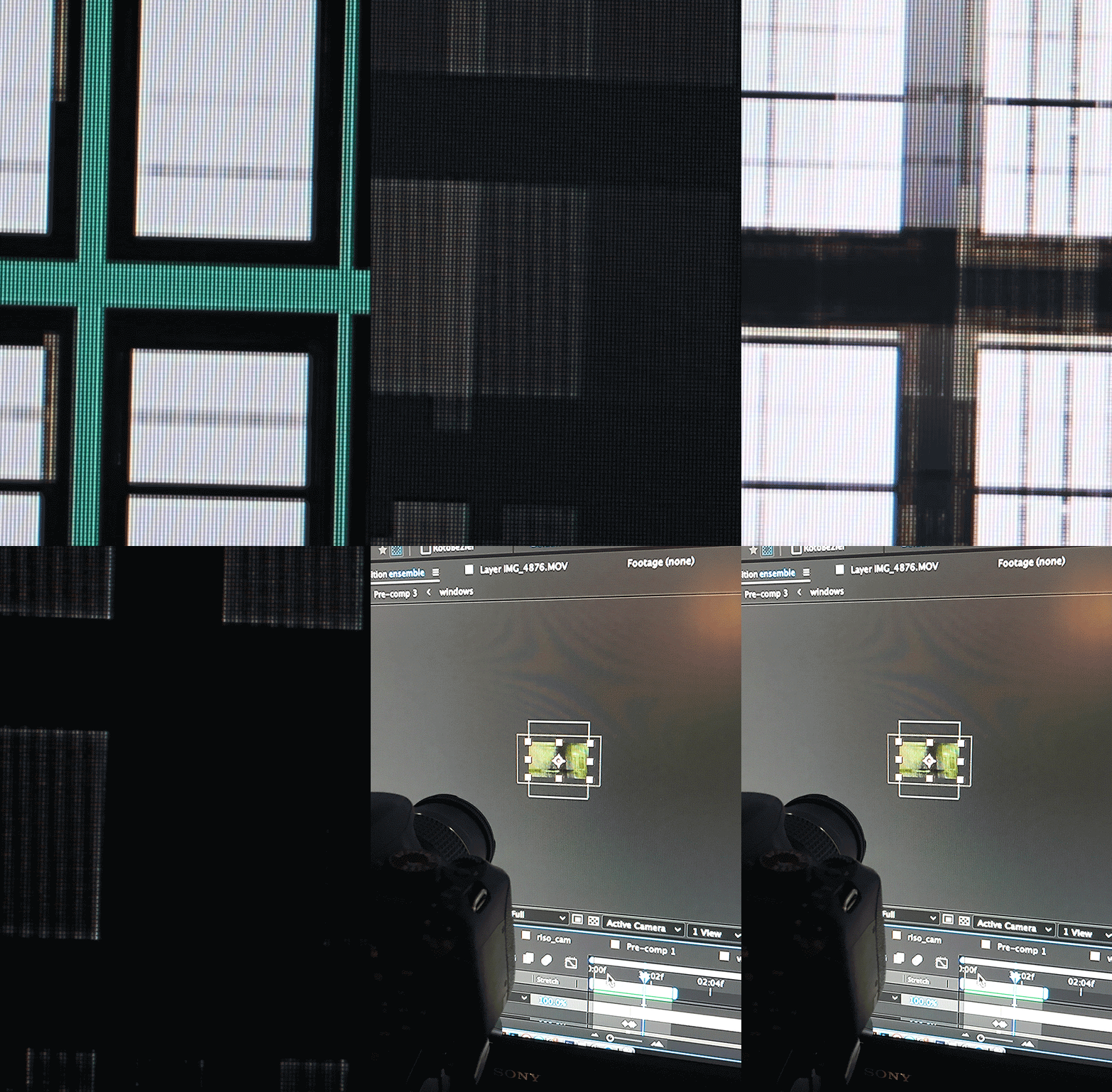
We drive deeper in, focusing on a singular city block. Here I chose to go for a more ”blocky” texture and distortion. I decided to shoot CG animation through a macro lens on an old television set. I then brought that footage back into the digital realm to illuminate the original animation through luma mattes. Smoke was then blown onto the screen to create a more organic transition to the next section.
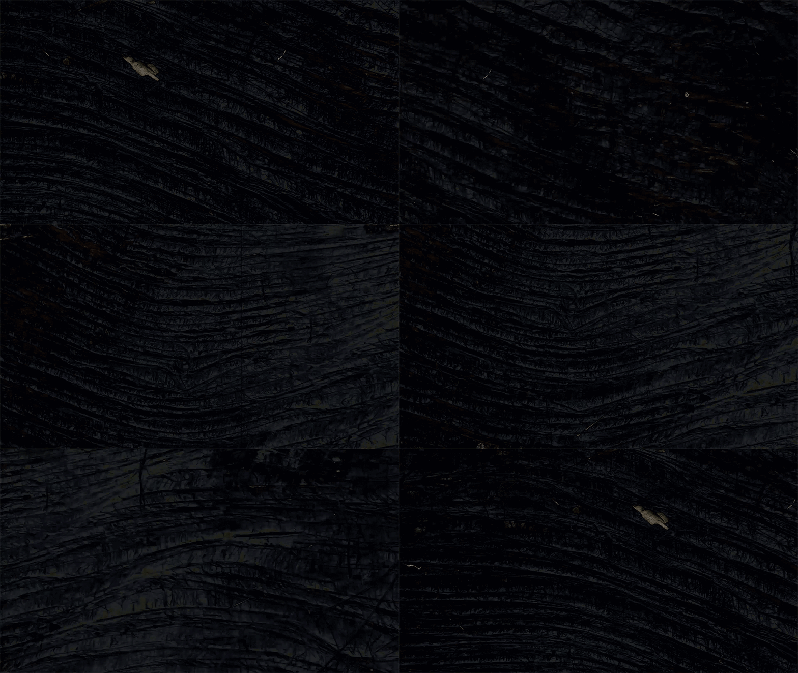
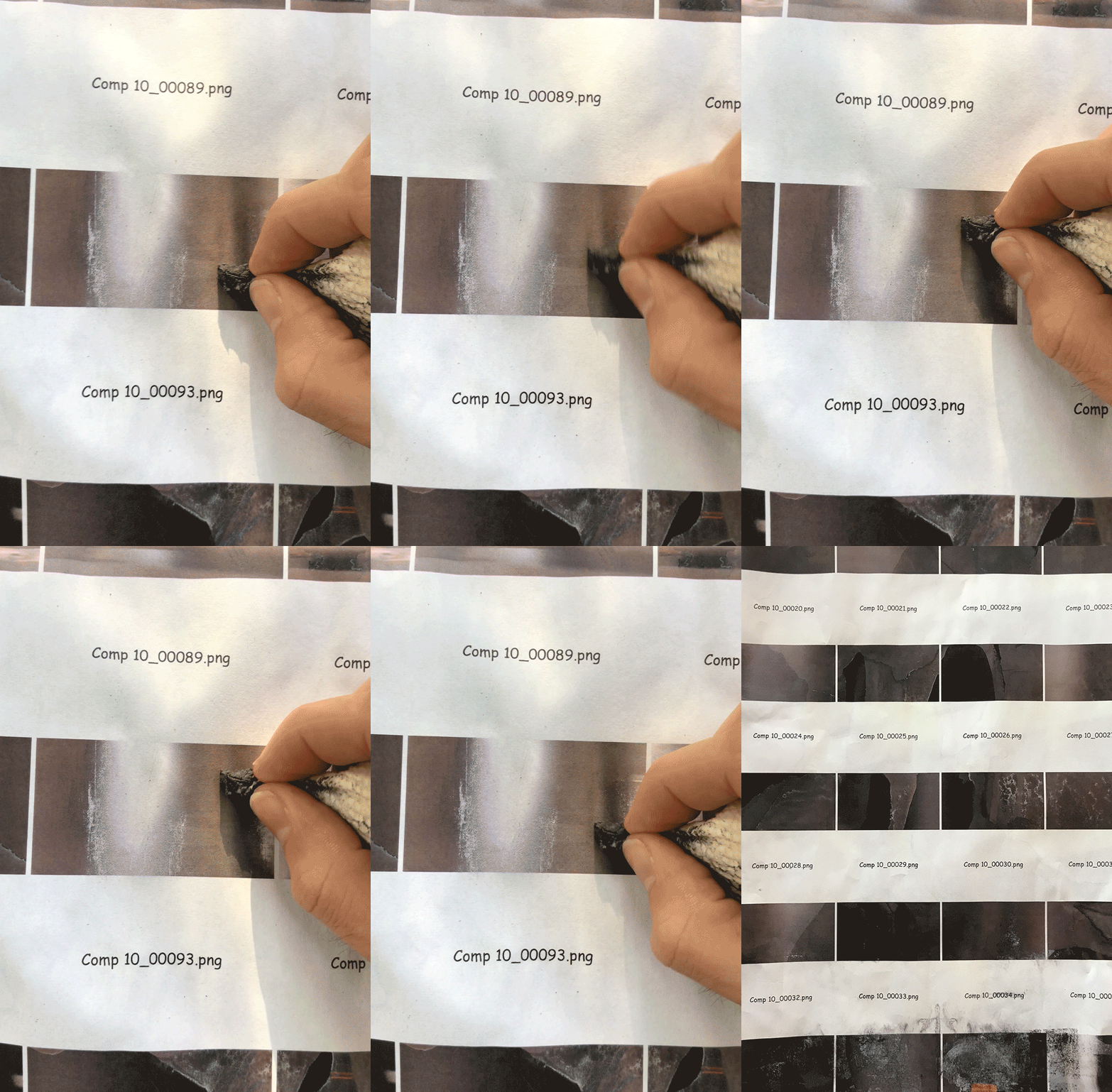
As we distill the city even more, now traveling from a city block to a string of connected rooms, eventually leading to a subway train. I used a technique where I printed frames of video footage off of a laser printer, poured acetone over the prints, distressed each frame, and scanned them back in. This technique created an alternative motion blur and was reminiscent of old film stock. Similar to how a subway train is a series of connected rooms strung into a line, this is a series of images printed in a row.
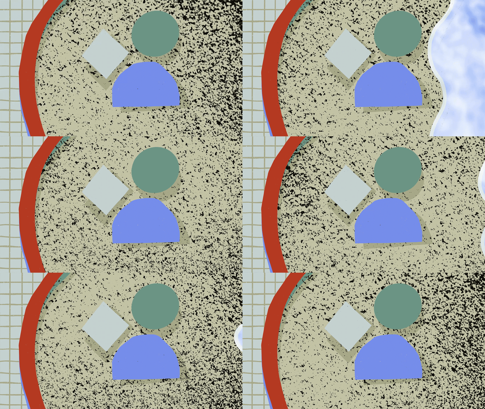
For the final section, the individual revealed on the train, I wanted to create the most human type of distortion I could. I selected paint strokes and canvas to drive the grain. Masks were then animated with an oil pastel that drove the overall lighting effect. I thought this innately organic and personal treatment of image-making would best suit the emotional translation of the human image.

Evoke.
With my explorations complete, I set off with the goal of evoking emotion. I wanted to continue to utilize grain but in a more narrative-based way. I really gravitated towards the look of film grain from early color movie cameras. I found the footage of Frank Capra and George Stevens, two American World War Two film directors, to be extremely compelling. The way they were able to capture the texture of their environments through handheld cameras was something I aspired to emulate. Similar to their footage, I found old family footage of beach scenes shot on 35mm film. I saw beauty in the imperfections; every scratch, piece of dust, Each light leak added to the atmosphere's unique aesthetic and story.

Drift :
To be carried slowly by a current of air or water.
A continuous slow movement from one place to another.
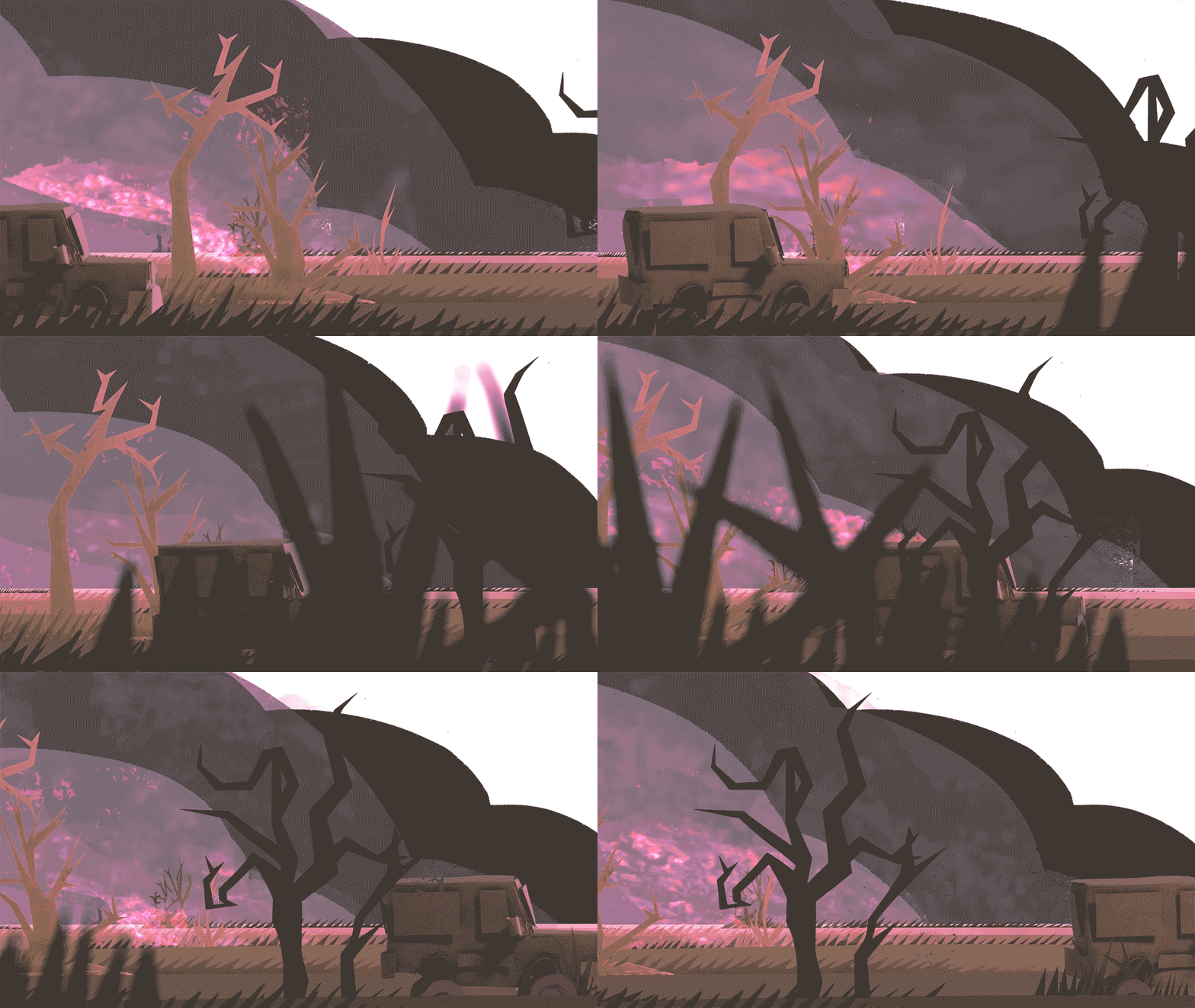
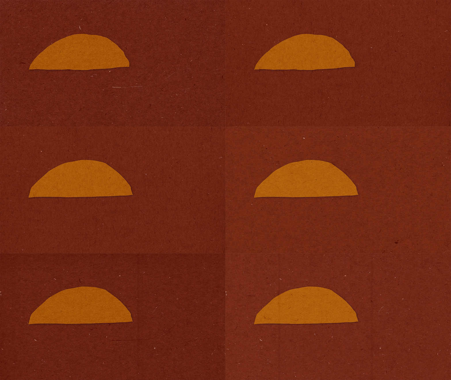
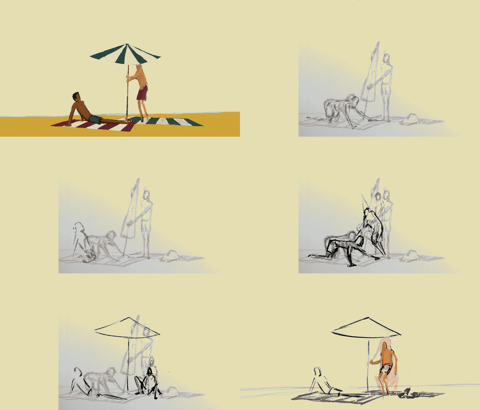
While showcasing grain I also wanted to tell a story about how easily one's reality can be turned upside down. I chose to use contrasting color palettes and sound cues to distinguish between the two realities. A consistent flow of grain throughout, with transitions and moments captured on 35mm film keep the piece grounded to the reference. Painterly 2D animation done in procreate was not only the most practical technique given the COVID-19 dispersal, it also allowed for a more imperfect human quality that could not have easily been achieved in 3D.

Improvised film scanner using a laptop and glass from picture frames.

Below is a quick look at the various layers that went in to the treatment of this film. From the flat procreate animation, to filming a screen covered with paper to diffuse the light giving the piece a unique glow.
